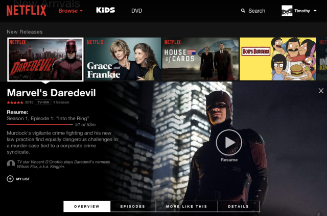
Maybe it’s just me, but I find it hard to find random shows and movies on Netflix. The “recently added” and “trending now” section are the list I see the most, but they do not have things I want to see.
I feel the way the Netflix user interface is currently setup, it is limited the view of all of the content the content. If you share a Netflix account like most people, the suggestion is usually not that accurate.

One thing I do notice is they want to force their original content down your Throat. Ultimately I would love to have a way to view the entire database opposed to these select slideshows based on genres they think I want to see.
What you think?


