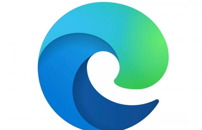
Microsoft has decided to give Microsoft Edge a modern look with the logo change.
The logo is now much further away from the original Internet Explorer logo.
I think the new logo will finally get the dreadful internet explorer days out of our heads.

Innovation Approved
Microsoft has decided to give Microsoft Edge a modern look with the logo change.
The logo is now much further away from the original Internet Explorer logo.
I think the new logo will finally get the dreadful internet explorer days out of our heads.

Share on Facebook Tweet it Email https://samadrobinson.com/the-black-effect-podcast-festival-is-coming-to-atlanta/#YmxhY2thZmZlY3Q Share on Facebook Tweet it

Share on Facebook Tweet it You now have the ability to buy a Stadia controller buy itself. Before you could…
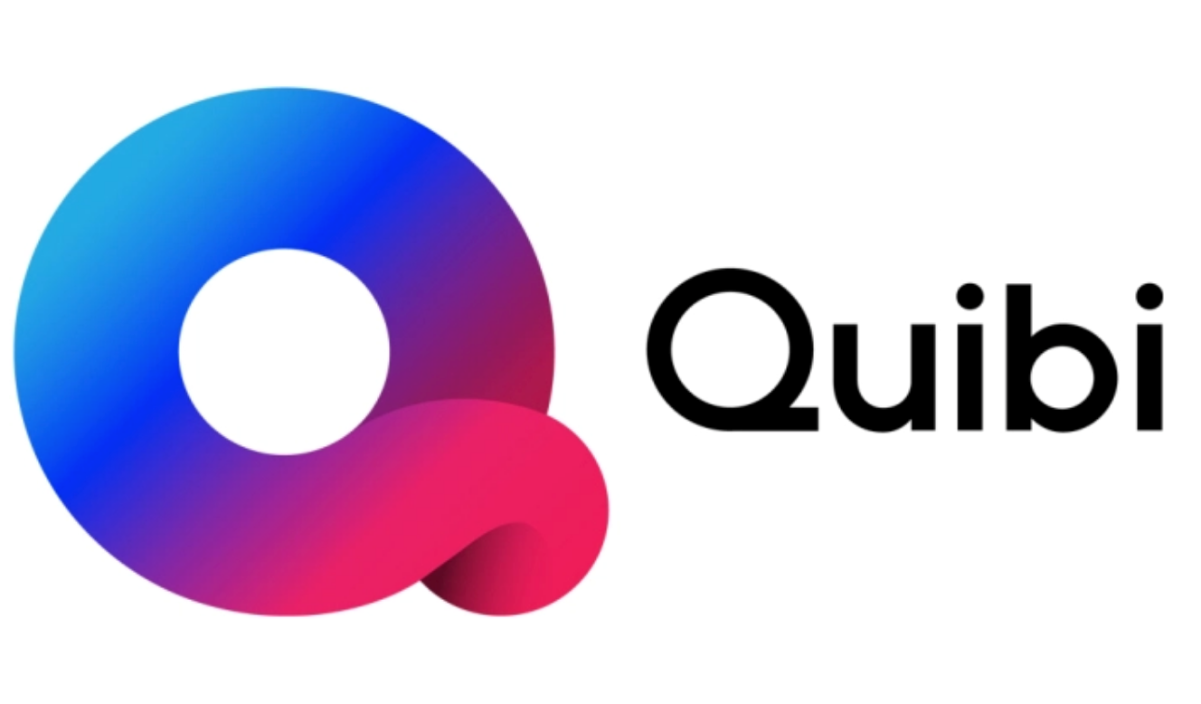
Share on Facebook Tweet it Email https://samadrobinson.com/sr-now-stream-fiend-episode-8-quibi-streaming-service-review/#UXVpYmkucG5n On this episode, Mado does a review on the brand new streaming service…
2 thoughts on “Microsoft Edge Gets A New Logo”